
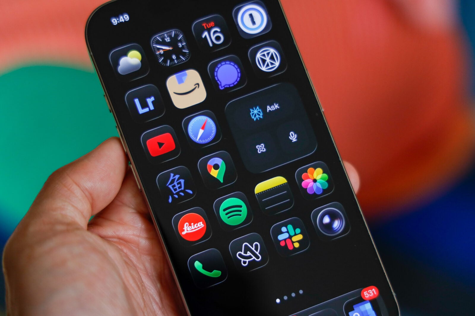
If Apple was hoping to make waves with its new Liquid Glass redesign in iOS 26, it definitely succeeded — though maybe not in the way it expected. The company touted the glossy, semi-translucent visuals as a bold step forward in design, a fluid aesthetic meant to make the interface feel alive and dynamic. But for many users, the “liquid” part of Liquid Glass has been more of a slippery mess than a design revolution.
In case you haven’t been following Apple’s ongoing iOS design saga, here’s the short version: a good number of users are frustrated. And honestly, I get it. Having switched to iOS 26 a few weeks ago, I’ve had my share of “wait, what?” moments navigating through the new UI. Some of Apple’s design choices are questionable — particularly when it comes to accessibility. The contrast levels, for instance, feel softer than ever, making it harder to distinguish between active and inactive elements. Simply put: contrast isn’t Liquid Glass’ strong suit.
Sure, it looks sleek on a marketing slide — but in daily use, that dreamy, reflective polish can quickly turn into an eye strain challenge. Personally, my biggest gripe isn’t even the overall blur — it’s Safari tabs mysteriously vanishing beneath other tabs. Still, we all have our breaking point, and Liquid Glass has definitely tested many users’ patience.
Apple Finally Gives In (Sort Of)
The good news? Apple heard the outcry — or at least, couldn’t ignore it. In the latest update, iOS 26.1, the company quietly introduced what many users had been demanding for weeks: a way to turn off Liquid Glass for real this time.
That’s right — Apple has officially added a tinted option that strips away most of the glass effect, offering a flatter, more traditional appearance. Here’s how you can do it:
- Update your device to iOS 26.1 (and yes, make sure it’s 26.1 — not 26.0.1).
- Head over to Settings → Display & Brightness → Liquid Glass.
- You’ll see two options: Clear and Tinted.
- Select Tinted, and voilà — the glossy blur fades away, leaving you with a cleaner, higher-contrast look.
That’s all it takes. A few taps, and your iPhone looks more grounded again — more “iOS,” less “windowpane art project.”
Why It Matters
This might not seem like a huge deal at first glance, but historically, Apple doesn’t often backpedal on design choices. The company is famous — or infamous — for sticking to its vision, even when the crowd pushes back. So, to see Apple roll out what is essentially an off switch for a headline feature? That’s significant.
It raises some interesting questions: Has Apple grown more receptive to user feedback, or did Liquid Glass simply flop hard enough to force a course correction? Maybe years of playing it safe with incremental iOS updates have made Apple more sensitive to criticism, or maybe this redesign just didn’t land as smoothly as expected.
Either way, the new “tinted” option marks a small but meaningful shift — a rare moment where Apple admits, even subtly, that it may have gone too far in chasing visual flair over functional clarity.
For now, it looks like Liquid Glass might not be the bright, futuristic design Apple imagined. And if you’ve got “Tinted” turned on right now, you’re not just adjusting your screen — you’re quietly joining the ranks of users who’ve reminded Apple that simplicity still wins.